Lost in the Ruins of the Food Pyramid

This is the first of two parts about the USDA’s attempt to guide the American diet and the famous, but now defunct graphic.
Building the Pyramid
The American diet is famously terrible. The obesity epidemic, which has been gaining momentum for years, has impressive reach; more than a third of all people in this country are now obese. The reasons for this epidemic are complicated and multi-factorial, and it has no easy solutions. One misguided public health awareness campaign trying to tackle the obesity epidemic serves as an example of how the best intentions can lead to unforeseen consequences.
The USDA has been trying to guide the eating habits of the United States population since the end of the 19th century. Early on it was recognized that the guidelines had to be simple to understand and remember. For most of the 20th century these guidelines were distributed in schools and were very simple. From the post war years to 1992 there were only 4 food groups (Fruits and vegetables, dairy, meat and cereals) and not much guidance on how much one should eat. In the early 90’s, the USDA decided to update these recommendations with a new, easy to understand way to display it. If it were simple, any one could follow its directions and improve their diet. Thus, the food pyramid was made.
The Pyramid’s Shadow
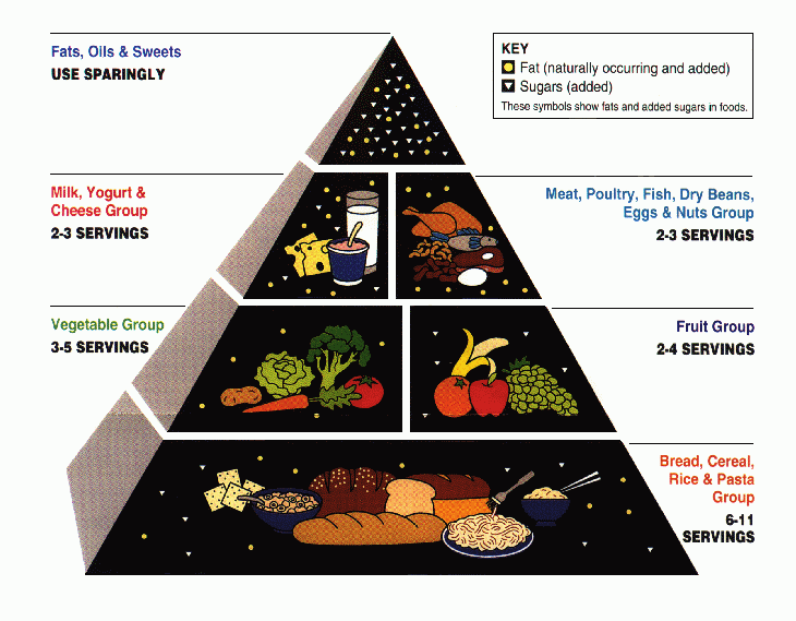
This influential graphic was ubiquitous. It could be found on the sides of cereal boxes, the walls of school cafeterias and classrooms through out the 90’s and early last decade. It said how much of each of the 6 different food groups you should eat. This guideline was visually appealing and easy to implement. People knew the food pyramid and followed it.
While the pyramid had the best intentions, the simplicity of the graphic was misleading; you could follow the pyramid and still eat unhealthily. For example, 6-11 servings of many of the foods shown on the bottom layer (such as spaghetti, white bread and other non-whole wheat starches) is too much. Excess carbohydrate consumption is associated with the development of diabetes and obesity. The pyramid made no distinction between a whole grain slice of bread and a piece of white bread. There is a huge difference in how your body deals with whole grains versus refined, white bread products. Further more, one of the carbohydrates most implicated in the obesity epidemic, the potato, is included as a vegetable! Sure it grows on a plant but it is one of the largest sources of carbohydrates for Americans and should be included in the carbohydrate food group. Unfortunately the graphic represented what the average American actually ate, not how much they should eat.
The Pyramid Crumbles
As obesity rates continued unabated, the old food pyramid began drawing more and more criticism for its short falls. The USDA realized that something had to change. Critics agreed that the pyramid was based on out-of-date evidence. Research shows that a diet heavy in fruits and vegetables is best. Fat, which was villain-ized on the old pyramid, is actually good in appropriate quantities if it comes from plant and fish oils. The food pyramid had to be revamped to include more fruits and vegetables, less carbohydrates and including other lifestyle factors such as exercise and portion control.
The USDA had to come out and say that most Americans ate poorly and were getting fat. They were hesitant, just as you would be hesitant to tell your wife she looked fat in that old dress she pulled from the back of the closet. The cold hard reality is that Americans needed to exercise more, eat fewer calories and get rid of the processed sugars, grains and foods and the USDA knew that Americans wouldn’t be happy.
Check in soon to read how the USDA tried to lead us out of the ruins of the food pyramid. You will have to decide for yourself how lost we are.
Be well,
Dr. Bruce Feinberg


